MFI/RSIThis is a simple study that combines MFI and RSI and provides buy/sell alerts.
The red lines are MFI.
the blue lines are RSI.
Boundries are colored as the indicators and are user configurable.
Black triabgles are buy/sell points when both MFI and RSI are overbought/sold.
"Buy sell" için komut dosyalarını ara

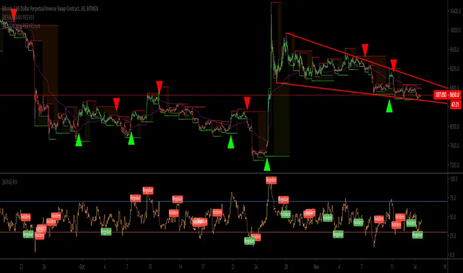
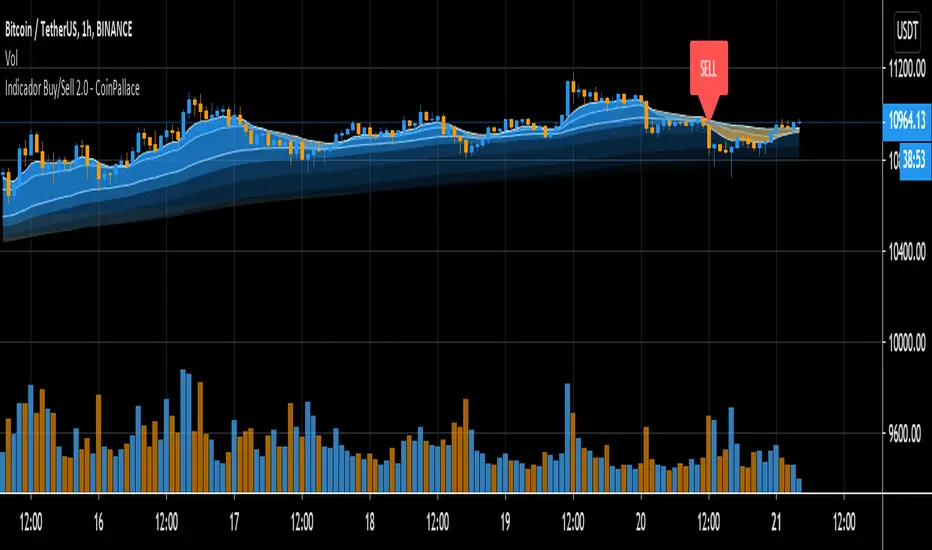
[BERA]KEANU REEVESThis is BUY/SELL indicator integrated with support and resistance (HIGH AND LOW).
THIS IS ONLY FOR TESTING PURPOSES(SOME PEOPLE ASKED ME A TRY), I WILL REMOVE IT.
Indicator based on Average true range .
LIME ARROW = LONG
RED ARROW = SHORT
LIME COLOR BARS IF GREEN ARROW CONDITION VALID.
RED COLOR BARS IF RED ARROW CONDITION VALID.
>CURRENT SETUP OF METRICS IS IDEAL FOR BTC H1 CHART, FOR ALTCOINS YOU SHOULD USE DIFFERENT METRICS,
E-MINI FUTURE BUY/SELL ARROW SIGNALS INDICATOR E-MINI FUTURE BUY/SELL ARROW SIGNALS INDICATOR
✅ Works for Daily charts and Intraday charts
✅ Good to short-term and medium-term scalping
✅ Analyzes E-Mini Futures Trend in real time
✅ Generates Buy, Sell signals
✅ Trending Indicator

Q Trend&Bar Buy/Sell SignalsHello traders!
Q Trend&Bar Buy/Sell Signals is finally LIVE!
Purple signal (B1 B2 S1 S2) indicates a long and stable trend starts. B is buy, S is sell, *1 shows the trend is trying to turn, and *2 shows the trend confirms that turn (eg. shorts at S1 and increase your short pos at S2 or cover if you see a B1, etc).
Red signal (B S) indicates a shorter time frame trend starts (pullback, breakout failure reversal, etc).
Orange signal (B S) indicates a even shorter farme trend compares to red signals.
Overall, as ranked in trend power, purple 2 > purple 1 > red > orange.
Happy trading ;P
Q
FG-DIVERGENCE V4 {50/15-Series} [Buy/Sell]This script is derived from the FUSIONGAPS V4 {50/15-Series} to generate buy/sell signals.
~ * ~ * ~ * ~ * ~ * ~ * ~ * ~ * ~ * ~ * ~ * ~ * ~ * ~ * ~ * ~ * ~ * ~ * ~ * ~ * ~
Note:
In no way is this intended as a financial/investment/trading advice. You are responsible for your own investment decisions and trades.
Please exercise your own judgement for your own trades base on your own risk-aversion level and goals as an investor or a trader. The use of OTHER indicators and analysis in conjunction (tailored to your own style of investing/trading) will help improve confidence of your analysis, for you to determine your own trade decisions.
~ * ~ * ~ * ~ * ~ * ~ * ~ * ~ * ~ * ~ * ~ * ~ * ~ * ~ * ~ * ~ * ~ * ~ * ~ * ~ * ~
Please check out my other indicators sets and series, e.g.
LIVIDITIUM (dynamic levels),
AEONDRIFT (multi-levels standard deviation bands),
FUSIONGAPS (MA based oscillators),
MAJESTIC (Momentum/Acceleration/Jerk Oscillators),
PRISM (pSAR based oscillator, with RSI/StochRSI as well as Momentum/Acceleration/Jerk indicators),
PDF (parabolic SAR /w HighLow Trends Indicator/Bar-color-marking + Dynamic Fib Retrace and Extension Level)
and more to come.
Constructive feedback and suggestions are welcome.
~ JuniAiko
(=^~^=)v~
RYNO
Welcome to RYNO! One of the best all-around indicators that you will find. RYNO is capable of being used on any chart. From the 1m, 3m, 5m time frames all the way up to the D chart. Heikin Ashi candles are preferred for the most accurate signals.
BUY/SELL signals represent your move... it's up to you to pull the trigger. Set your alerts and automate this indicator.
Back tester is also available by request.

AlphaMind Buy/Sell Indicator Lite EarlybirdAlphaMind Buy/Sell Indicator Lite Earlybird
www.alphamindtrading.com
For full directions, go to www.alphamindtrading.com


(bullyena) Buy/Sell RSI Trend Change indicatorFeatures:
Shows buy/sell signal when RSI crosses above median levels. Default at 55.
The original median settings is filtered using multiple EMAs, SMAs and Bollinger Band in order to provide less noise and better signals.
Above median RSI- means trend is bullish
Below median RSI - means trend is bearish
Additional features:
Also has an option to use dual settings if you prefer overbought and oversold signals.


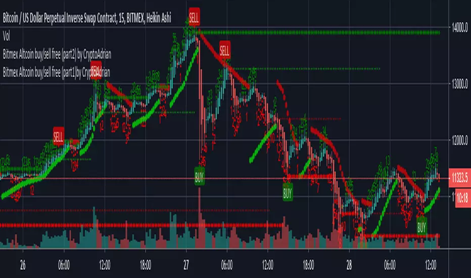
Bitmex Altcoin buy/sell free (part1) by CryptoAdrianThis script has two parts Bitmex Altcoin buy/sell free (part1) by CryptoAdrian and Bitmex Altcoin buy/sell free (part2) by CryptoAdrian
Combination of two will give you better results with clarification.
(soon will be published as one script)
For better results observe it for some time. If you didn't get how to use it PM me I will brief you :)
Hope you will like this. For any detail or doubts you can PM me on TV. I will try to reach you out ASAP .
Part 1
Part 2
Part 1 + Part 2
Please add this script to your fav so incase you find it difficult to find it can be seen in your fav and you will get it.
Thank You and happy trading :)
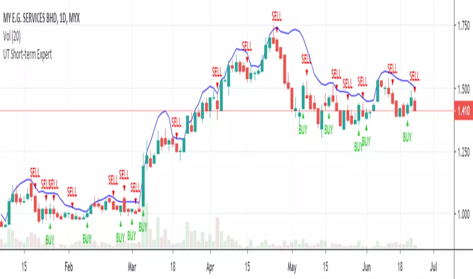
UltimateTraders Short-term Buy&Sell ExpertUltimateTraders Short-term Buy&Sell Expert acts as a guidance for short-term/intraday/contra trading.
EasyCrypto.club Buy/SellEasyCrypto Buy / Sell Signals Indicator is a trend following indicator that displays a buy and sell arrows to help you to determine whether the trade is truly going in your favor. This indicator works across any time frame which gives rise to some technical trading strategies such as using multiple time frame analysis or using this method alongside other trend following strategies.

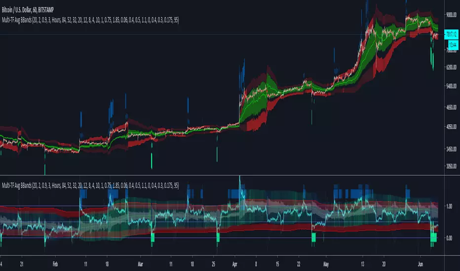
Multi-TF Avg BBandsMULTI-TF AVERAGE BBANDS - with signals (BETA)
Overall, it shows where the price has support and resistance, when it's breaking through, and when its relatively low/high based on the magic of standard deviation.
created by gamazama. send me a shout if u find this useful, or if you create something cool with it.
%BB: The price's position in the boilinger band is converted to a range from 0-1. The midpoint is at 0.5
Description of parameters
"BB:Window Length" is the standard BB size of 20 candles.
The indicator plots up to 7 different %BB's on different timescales
They are calculated independently of the timescale you are viewing eg 12h, 3d, 30m will be the same output
You can enter 7 timescales, eg. if you want to plot a range of bbands of the 12h up to 3d graphs, enter values between 0.5 and 3 (days) - you can also select 0 to disable and use less timescales, or select hours or minutes
Take note if you eg. double the main multiplier to 40, it is the same as doubling all your timescales
You can turn the transparency of the 7 x %BB's to 100 to hide them, their average is plotted as a thick cyan line
"Variance" is a measure of how much the 7 BB's agree, and changes colour based on the thresholds used for the strategy
---- TO START FROM SCRATCH ----
- set all except one to ZERO (0), set to 0, and everything after to 0.
Turn ON and right click -> move the indicator to a new pane - this will show you the internal workings of the indicator.
Then there is a few standard settings
"Source Smoothing Amount" applies a basic small sma on the price.
It should be turned down when viewing candles with less information, like 1D or more.
Standard BBands use an SMA, there one uses a blend between VWMA or SMA
Volume Weight settings, the same as SMA at 0, and the same as VWMA at 1
BB^2 is a bband drawn around the average %BB. Adjust the to change its window length
The BB^2 changes color when price moves up or down
Now its time to look at the parameters which affect the buy/sell signals
turn on "show signal range" - you see some red lines
buy and sell each have 4 settings
min/max variance will affect the brigtness of the signal range
range adjust will move the range up/down
mix BB^2 blends between a straight line (0) and BB^2's top or bottom (1)
a threshold of "variance" and "h/l points" is available to generate weaker signals.
these thresholds can be increased to show more weak signals
ONCE YOU ARE HAPPY WITH THE SIGNALS being generated, you can turn OFF , and move it back to the price pane
the indicator then draws a bband around the price to maps some info into the chart:
fills a colour between 0.5 & the mid BB^2 and converts relative to the price chart
draws a line in the middle of the midband.
controls how much these lines diverge from the price - adjust it to reduce noise
converts the signal range (red lines) to be relative to the price chart
if you like, you can adjust the sell & buy signals in the tab from and to and to match the picture. It messes with auto-scaling when moving back to though
enjoy, I hope that is easy enough to understand, still trying to make this more user-friendly.
If you want to send me some token of appreciation - btc: 33c2oiCW8Fnsy41Y8z2jAPzY8trnqr5cFu
I promise it will put a fat smile on my face
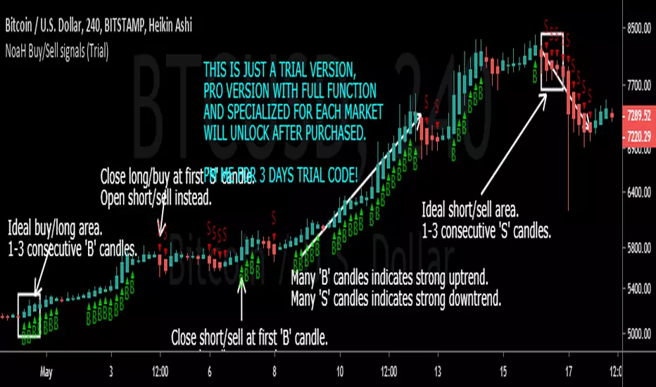
NoaH Buy/Sell signals Indicator (all market, all timeframes)Noah Crypto introduces a miracle 'Buy/Sell signal' indicator that gives huge positive profit on all markets:
- This indicator works on all markets, from stocks to forex, from commodity to crypto. You can applied it on all pairs, all timeframes.
- This indicator was optimized for Heikin Ashi chart, so please use it on Heikin Ashi charts only .
- This indicator shows best performance at M30, H4 and D1 timeframes, other timeframes are good also but the performance will not quite good in comparision to M30, H4 and D1 timeframes.
- This is just a demo version, PRO version specialized for each market will be provided after purchased.
Performance backtest shows on the following comments.
How to exploit this indicator:
A LONG/BUY ORDER:
- Good buy zone are 3 first candles marked with 'B' letter.
- Close/exit order on first 'S' candle confirmed.
- PRO version will show sell targets.
A SHORT/SELL ORDER:
- Good entry is 3 first candles marked with 'S' letter.
- Close/exit order on first 'B' candle confirmed.
- PRO version will show buy/sell targets.
Backtest settings:
- For crypto market: Initial capital $10,000, order size $3,000 (30% of max capital), pyramiding 1 order, commission excluded.
- For stocks market: Initial capital $100,000, order size $30,000 (30% of max capital), pyramiding 1 order, commission excluded.
- For forex market: Initial capital $1,000,000, order size $300,000 (30% of max capital), pyramiding 1 order, commission excluded.
Comment here or PM me for 3 days trial. PM me if you want bactest result for any specific pairs, those one must have data on tradingview.

[astropark - Premium] Long-Short Strategy V3This indicator works nicely between 5m and 1W timeframes :))) and you can set any alerts you like on both buy, sell and take profit signals!
Buy/Long at next candle's open price when you see a green "B" label on the screen, considering green cloud as support for more buys/longs (the bigger the cloud, the stronger the support).
Sell/short at next candle's open price when you see a red "S" label on the screen, considering red cloud as resistance for more shorts (the bigger the cloud, the stronger the resistance).
This indicator suggests some TP (Take Profit) for both longs (in blue color) and shorts (in purple color): you can start (at least partially!) closing the current trade
This is a premium indicator, so send me a private message in order to get access to this script.
Do you like my scripts? Offer me a coffee , a beer, a pizza or whatever :)
BTC jar: 1K5kuYQPEqoNo6GRmJbHWMPmqwKM5S3oRR
ETH jar: 0x091b541a6dd6fe08c4e7bd909baafb2fce9b975e
LTC jar: LSVoAChsZrVsvbNyUfdpxtFpDAUSaUTUig
XRP jar: (XRP deposit tag) 103997763 (XRP deposit address) rEb8TK3gBgk5auZkwc6sHnwrGVJH8DuaLh
PS: Do you need a customization or do you need a dev who implements your strategy? send me a private message ;-)
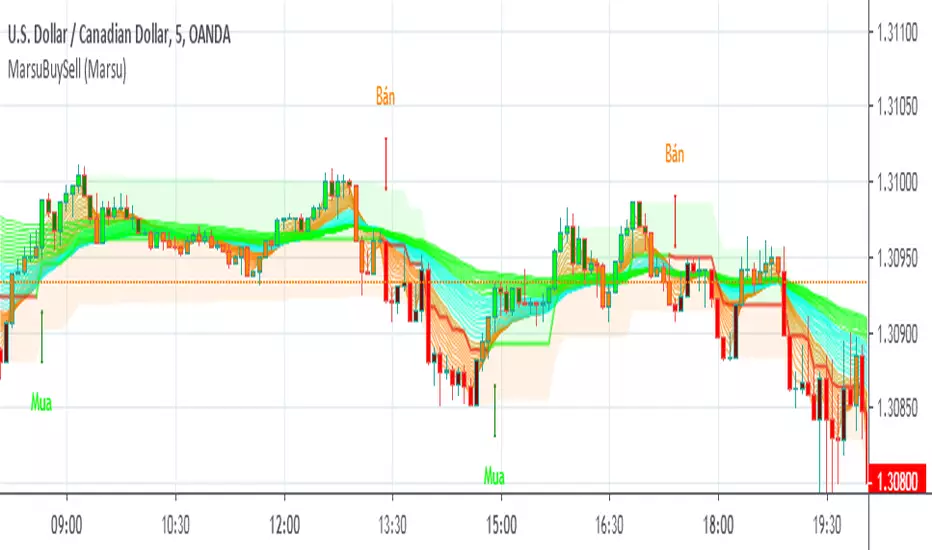
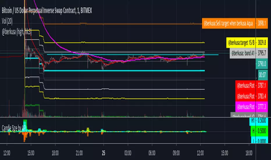
@berkusa buy sell bands 1m 5 m 15mshort term buy sell zone
let me know if you like it on telegram @berkusa
[ProfitTrailer] DEMA Spread Buy/Sell StudyProfitTrailer buy/sell study for DEMASPREAD strategy.
The script highlights the region where trailing is most likely to succeed.

[ProfitTrailer] DEMAGAIN Buy/Sell Study (standalone)ProfitTrailer buy/sell study for DEMAGAIN strategy.
The script highlights the region where trailing is most likely to succeed.
